
To the extent that any data visualization endeavor can be described as a series of decisions, I hope that this condensed account of my Park Life decision making process may be useful.
The Data

The National Park Service maintains a separate spreadsheet for each Park so I downloaded all 58 (there are 59 National Parks but Sequoia and Kings Canyon are jointly administered), along with a User Guide.
The sheets contained anywhere from 692 rows (Kobuk Valley, Alaska) to 5998 rows (Great Smokey Mountains, North Carolina and Tennessee) and 33 columns of information. The data included taxonomic ranks, scientific and common names, occurrence, abundance, nativeness, ozone sensitivity, and threatened and endangered classifications amongst other attributes.
With a general sense of the direction I wanted to go in, I cleaned and sorted the data, and pulled together a master sheet that would allow an easy overview of each park. I added annual visitor numbers and the size of each park to help with park selection later.
Exploratory Visualizations
With a more sound understanding of the data, I sketched some ideas for directions I might pursue.


Visualizing the data allowed me to glean insight:
- Plant life generally comprises between a half and two thirds of the total number of species in any given park.
- Mammals are really a small proportion of life in the parks.
- There isn't much diversity of order in the reptile kingdom.
- There are so many birds, particularly in Death Valley National Park!
- Although there are only 325 species in Hot Springs National Park (the smallest NP), there are 49 orders. That's a lot of diversity per square foot.
- There are so many different orders of fish!
- The number of orders (35–80) within the animal kingdom could be the basis for a color palette.
- The stacked bars present a strong opportunity for color work. The bars remind me of bar codes. I like the concept of creating a unique "bar code" for each park.
- Cluster charts allow for a demonstration of hierarchy. They also allow an emphasis on layers on information.
- Taxonomic ranks—classes, orders, families, species—provide opportunity for serious color work.
The final Concept
Having explored various options for visualizing the data, I needed to make a decision. What type of visualization would best tell the story I wanted to tell?
In thinking about some key words that fit with my story: diversity, variation, beauty, hidden … I concluded that my narrative was more about evoking a feel of wonder, excitement, appreciation, than it was about showing whether or not there are wolves in Yellowstone. While that’s a legitimate question it just wasn’t what had first inspired me about the project.
What intrigued me as much as anything was my own reaction to the data, finding out that life to that extent existed around me. It piqued my curiosity. I was excited by its diversity, and in awe of the inherent beauty in such diversity.
I wanted a solution that would allow me not only to communicate the data, but also my own response to it.
Looking at Andy Kirk’s project map matrix, I was firmly in the exhibitory rather than explanatory area and was edging more towards feeling than knowledge.
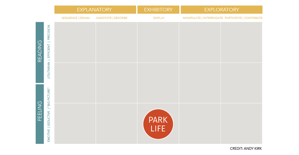
In this light I revisited the two concepts that I though had most potential and subsequently discarded the clusters. While I liked the clusters a lot from an aesthetic perspective, it felt a bit like I had just taken the image on the screen and turned it something physical. There was no translation involved. It felt too literal. I settled on the bar code option.
Next, I considered the final output, the materials I would use, and how I would encode the data, in other words how I would mark the material.
Output. I considered online, printed, and physical solutions. An online solution has the advantage of being easily sharable and widely accessible, but it is inherentlly lacking in dimension. In considering my goal, I felt that a screen would separate the viewer from the work, rather than engaging them from different viewpoints. I would also have limited control over color. A printed solution would allow for much better control over color, but felt a little flat—literally and metaphorically. A physical solution would potentially give maximum control over color, provide an opportunity for dimensionality, and would allow for more flexibility in terms of size. And after all, National Parks and the species therein are inherently physical. I decided on a physical output.
Materials. Using paper or canvas immediately felt restrictive. They are relatively fragile materials and that didn't quite fit with what I wanted to communicate. Clear acrylic appealed to me. I liked its strength and was also intrigued by the opportunity it provided for extra dimensionality by allowing layers of color and consequently shadows. Wood was also appealing. The robust resilience of wood coupled with the fact that it is a natural material checked a few boxes. At this point I was undecided on whether acrylic or wood would be the better option.
Marks. My thought process around how to encode the data now consisted of paint, markers, and thread or yarn. I loved the flexibility of paint. There would be no limitations on my color palette, which would not be the case with markers or thread/yarn. The latter would be particularly restrictive so I discounted that option immediately. Markers would allow me better control as I have limited experience in working with paint brushes, but the coverage would most likely be less impactful. Would drying time be an issue? Regardless, I settled on paint.
I tested paint on both acrylic and wood. I discounted the acrylic option. I couldn't get the paint to appear evenly opaque. Clearly there was a learning curve here that my thesis timeline could not accommodate! Wood was the material of choice.
The Data (Again)
Going back to the master data sheet, I was now faced with thinking through the logistics of translation:
- What size would each panel be? The scale needed to be large enough that I would be able to make a thin enough line using paint, but not so large that the panels would be unmanageable. After some basic arithmetic and experimentation, I settled on a scale of 1 inch = 10 species.
- Which species would I encode? Encoding all plant and animal species would be incredibly time consuming, and all the panels would be at least six feet in length. I decided to narrow my focus to animal species only.
- How many parks would I visualize? I wanted an odd number for purely aesthetic reasons. Five seemed doable in the timeframe.
- Which parks would I visualize? To decide this, I drew up a set of selection criteria:
- Completeness of data
- Diversity—geographic, size, visitor numbers, ecosystem
- Practicality, i.e, not so much life that the panels end up being too large to manage
Using these criteria, I selected Death Valley, Glacier, Grand Teton, Hot Springs, and Shenandoah National Parks.

The panels
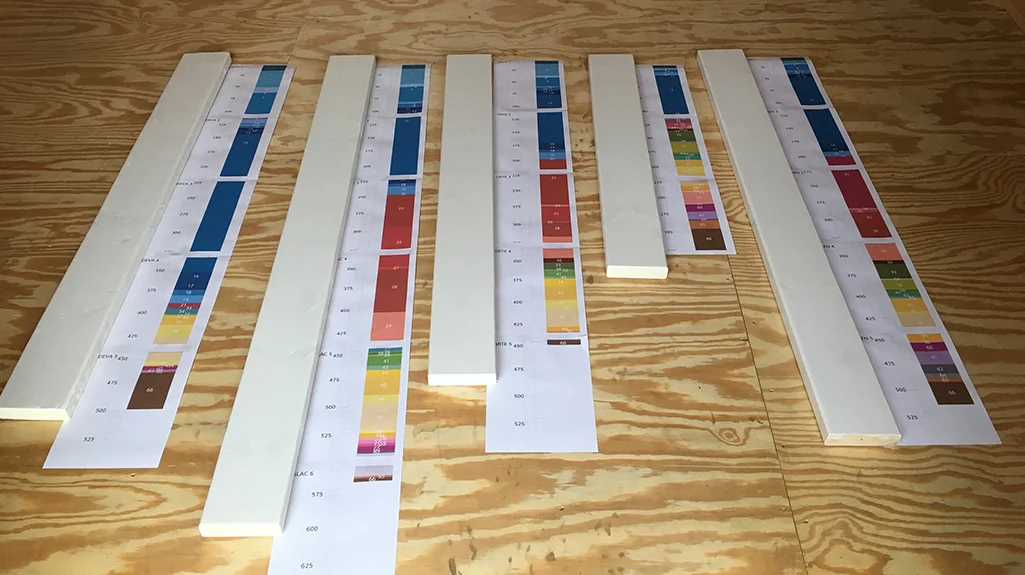
By now I knew that color would be the most critical element of my final visualization. I wanted to represent each order with a unique color, but also group those orders according to class. It was important that the palette reinforce the messages of the beauty and diversity. Below is the final color palette, which I created in Illustrator.

I then transferred the colors to actual size templates that would serve as a guide for painting. Then I bought wood and paint.
First, I filled, sanded, primed, and cut the wood panels to length.

And finally, I started painting. The whole process took several days as I had to wait for colors to dry before I could tell if they were opaque enough or needed additional coats. Colors that didn't include any white always needed additional coats! In order to ensure consistency across the panels, I mixed each color once and applied it to all five boards (assuming that order existed in all five parks) before moving on to the next order.
I also learned not to let the dog into the shed while I was painting. Argh!

When the painting was complete, I sanded the edge of the panels. My plan had been to paint the edges a neutral color but I found that I really liked the look of the natural wood against the bright colors, so I sealed it and left it as-was.

The final panels pictured above right are, from left to right, Death Valley, Glacier, Grand Teton, Hot Springs, and Shenandoah National Parks.
the installation
While it is important to me that this installation works as a standalone piece, it is my hope that some who see it may be curious and wonder if it means anything. With those people in mind, I created an information card (pictured below) that serves as a guide on how to read the panels. This card will be hung alongside the installation.

Similarly, I created this website, in part to allow easy access to the data so that people can dig about and find answers their own questions, but also to invite conversation about this piece of work, my process, and data visualization in general. Please get in touch if you have comments, suggestions, or questions about any of it.
last Thoughts
As is often the case with such a project, it was not a one-woman effort. In fact this one was a five-woman effort. I am forever grateful to my fellow “data babes” Janet Macdonald, Sarah Maravetz, Sarah Reed, and Marlene Rogalski for their input and encouragement. You all inspire me.
InViz Program Director Heather Bradbury, you and the rest of the MICA faculty that you assembled, changed my world. Thank you.